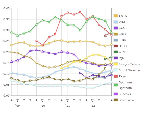
For those who keep track, I have updated each of the competitive telecom financial trends plots to reflect Q4/2012 numbers, except for a few straggling morsels of data that will get here when they get here. But in addition I am considering changing the relative capex plot to reflect the trailing 12 months rather than the individual quarterly number. The reason is obvious: capex can be very lumpy, which makes it hard to spot trends. Before I make the change officially, here’s a first look:
Capex/Revenue for the trailing 12 months

Here we can more clearly pick out a few trends from the last four quarters. The bigger spenders, e.g. Zayo, Optimum Lightpath, and tw telecom, have been seeing a relative pullback in their capital intensity, while those at the other end of the spectrum, e.g. Sprint, Broadview, Level 3, and Earthlink have been seeing a steady rise. Each company has its own reasons for their capital spending plans of course, but it’s interesting that the tendency lately has been toward convergence (albeit a long way from getting there!)
If you haven't already, please take our Reader Survey! Just 3 questions to help us better understand who is reading Telecom Ramblings so we can serve you better!
Categories: Fiber Networks · Financials


Thanks Rob. I did some analysis on capex/revs for telcos many years ago, and matched it to EBITDA margins. There was a pretty good correlation – highest capex/rev and margins for carriers investing in local networks, lower for alt nets investing in LD networks only, lowest for those largely re-selling others’ networks. Needed to adjust for non-steady state capex (eg start ups, or major investment programmes). Would be interesting to know if that relationship still holds, whether there are any outliers?